Competition meets simplicity
Challenge
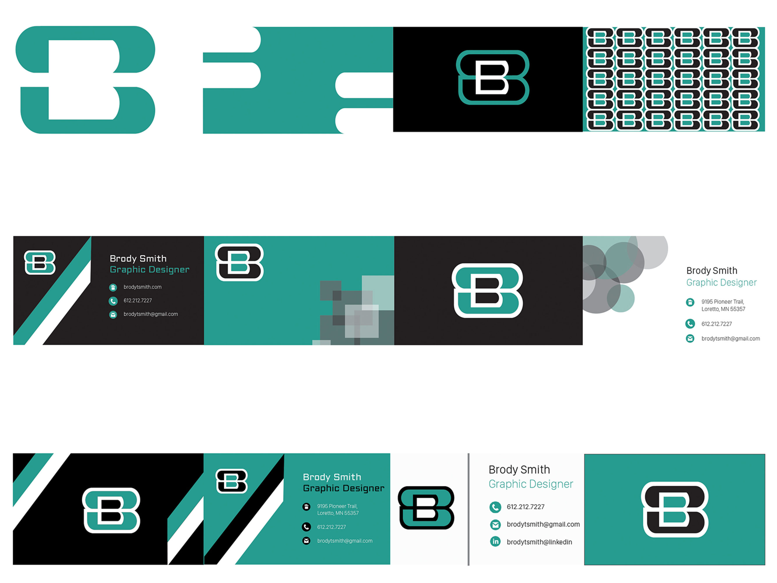
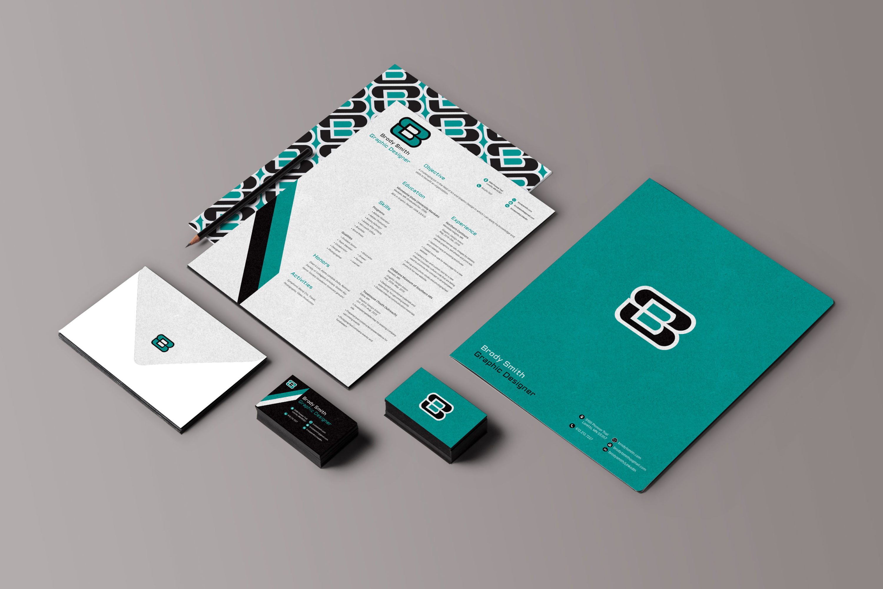
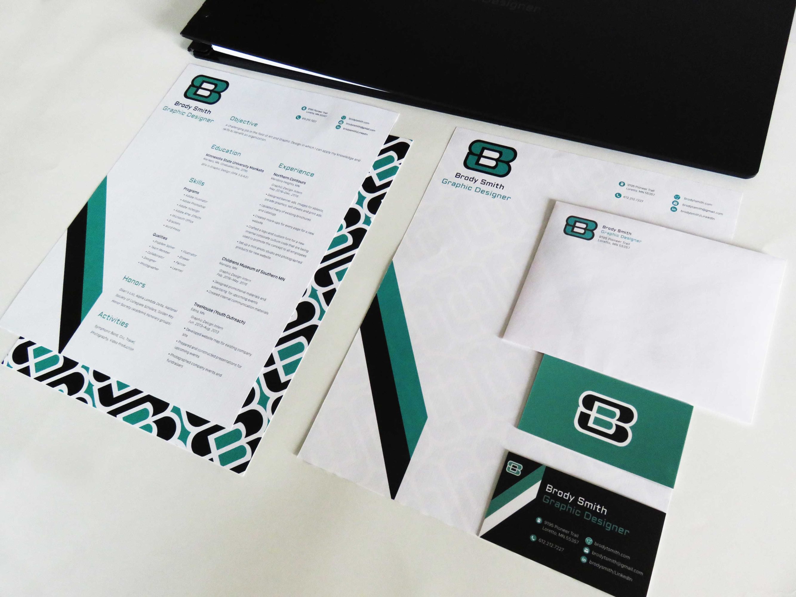
The goal was to create a brand identity system that showcases the type of design I want to pursue. The system should also work with many different applications.
Solution
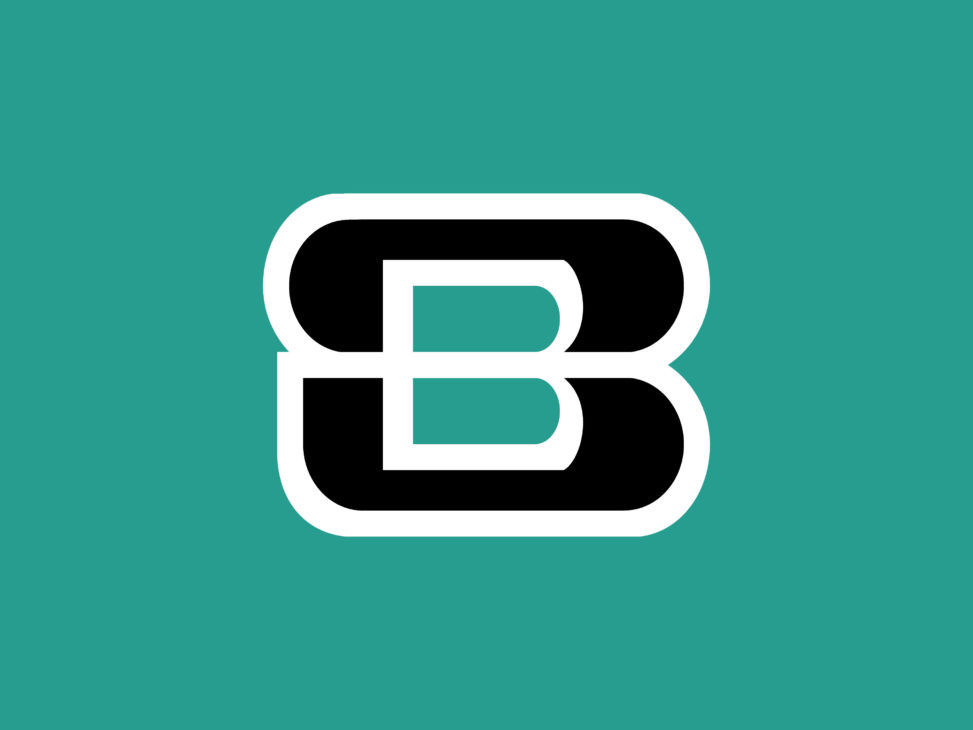
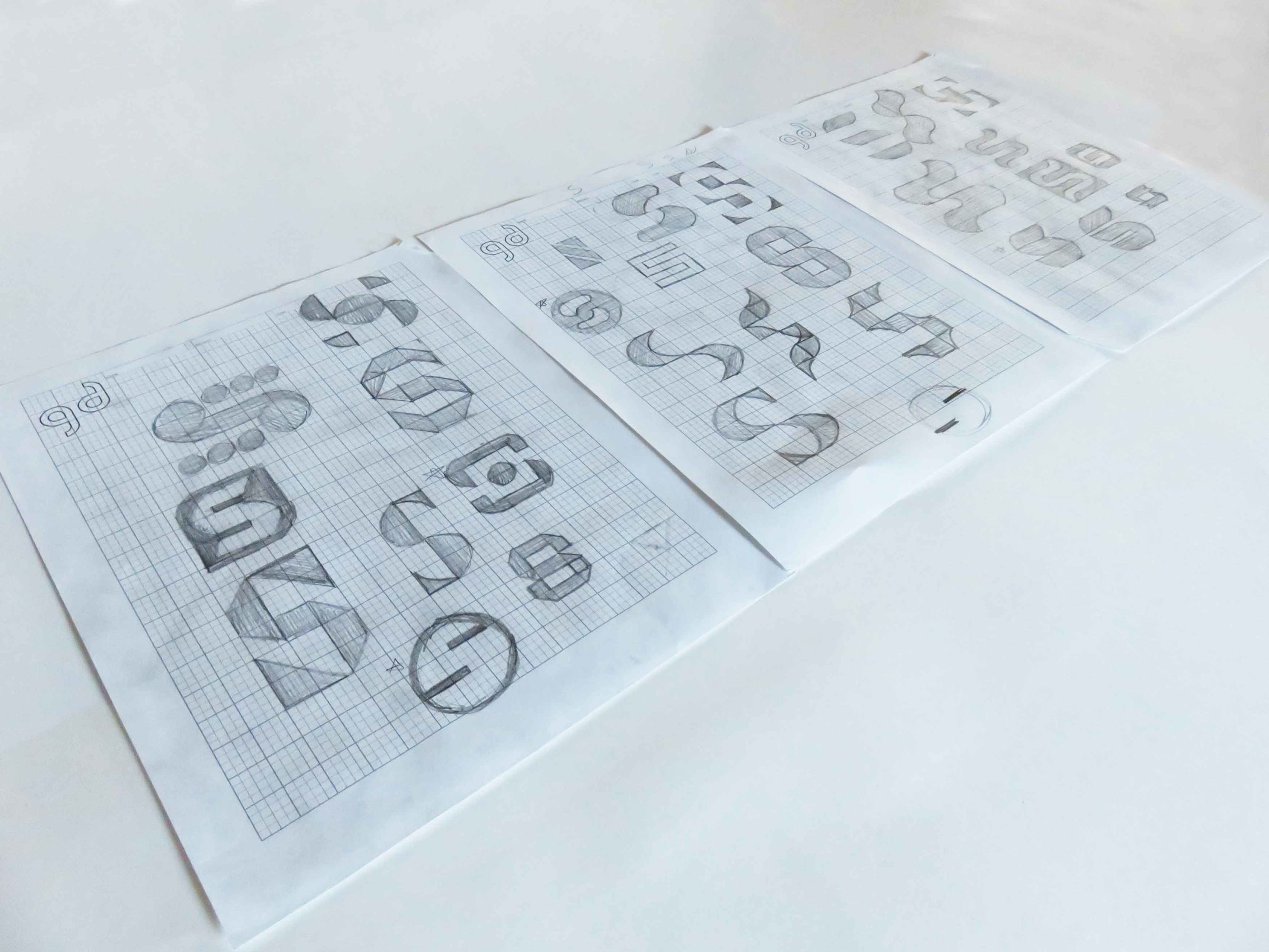
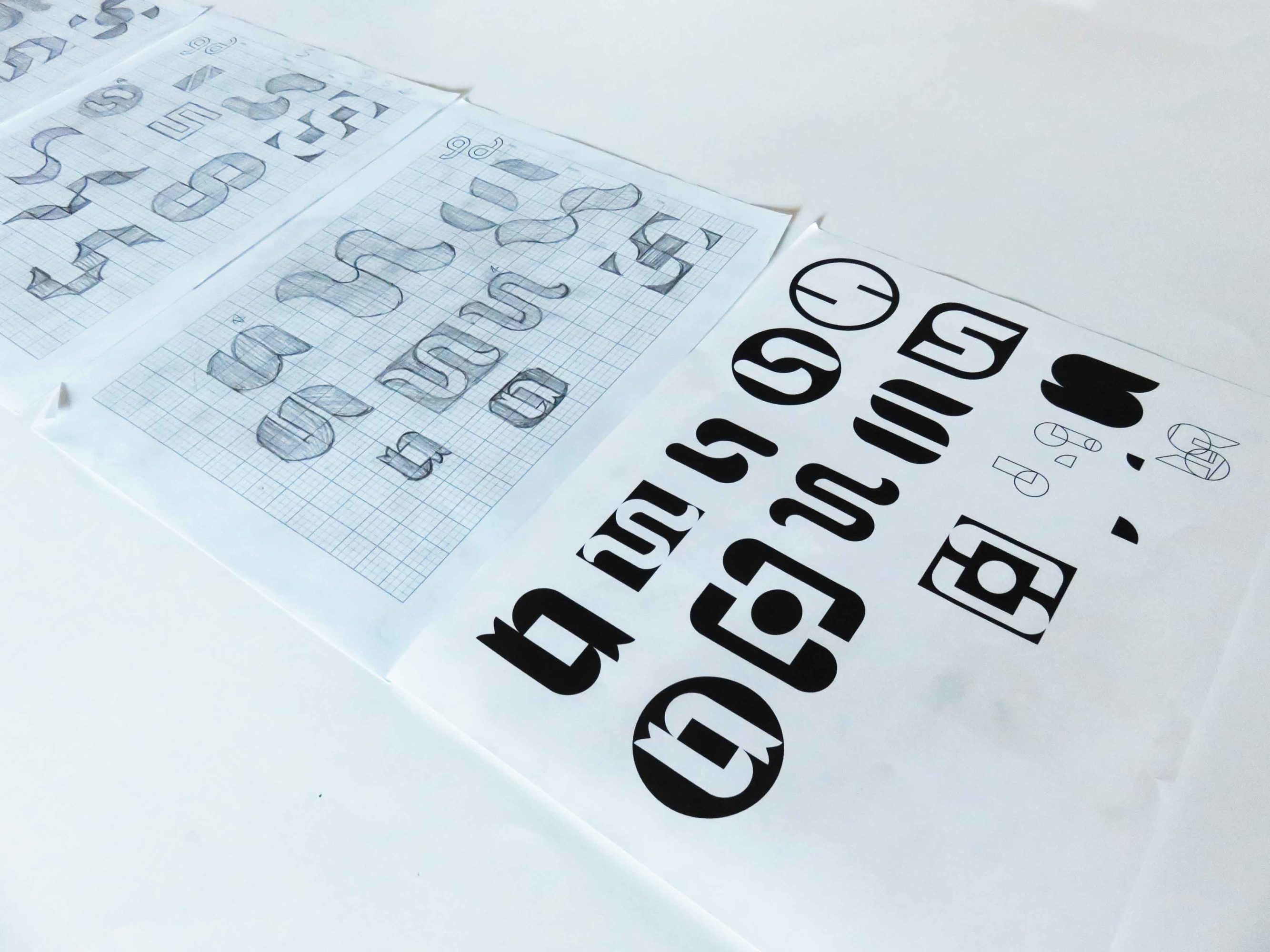
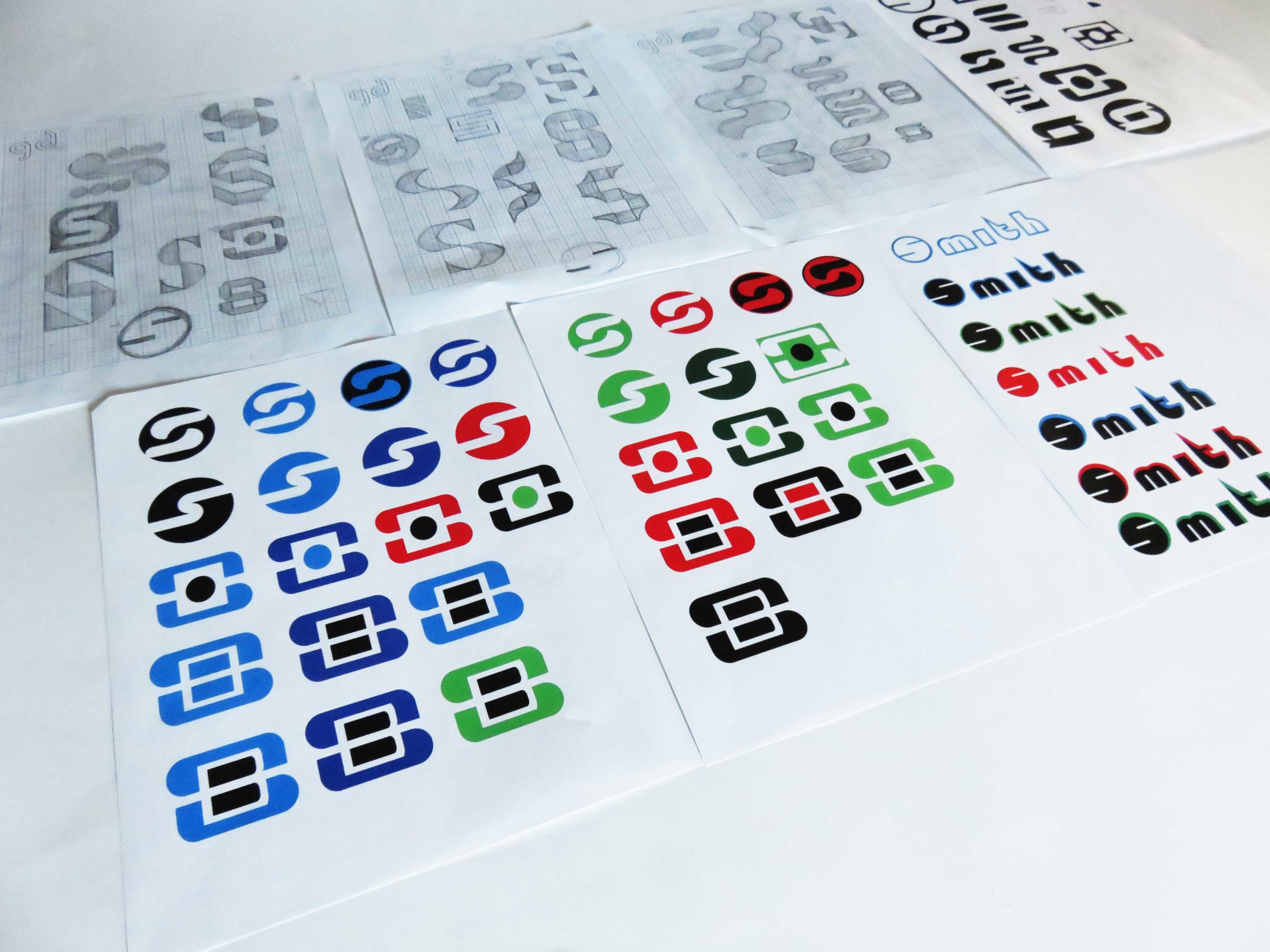
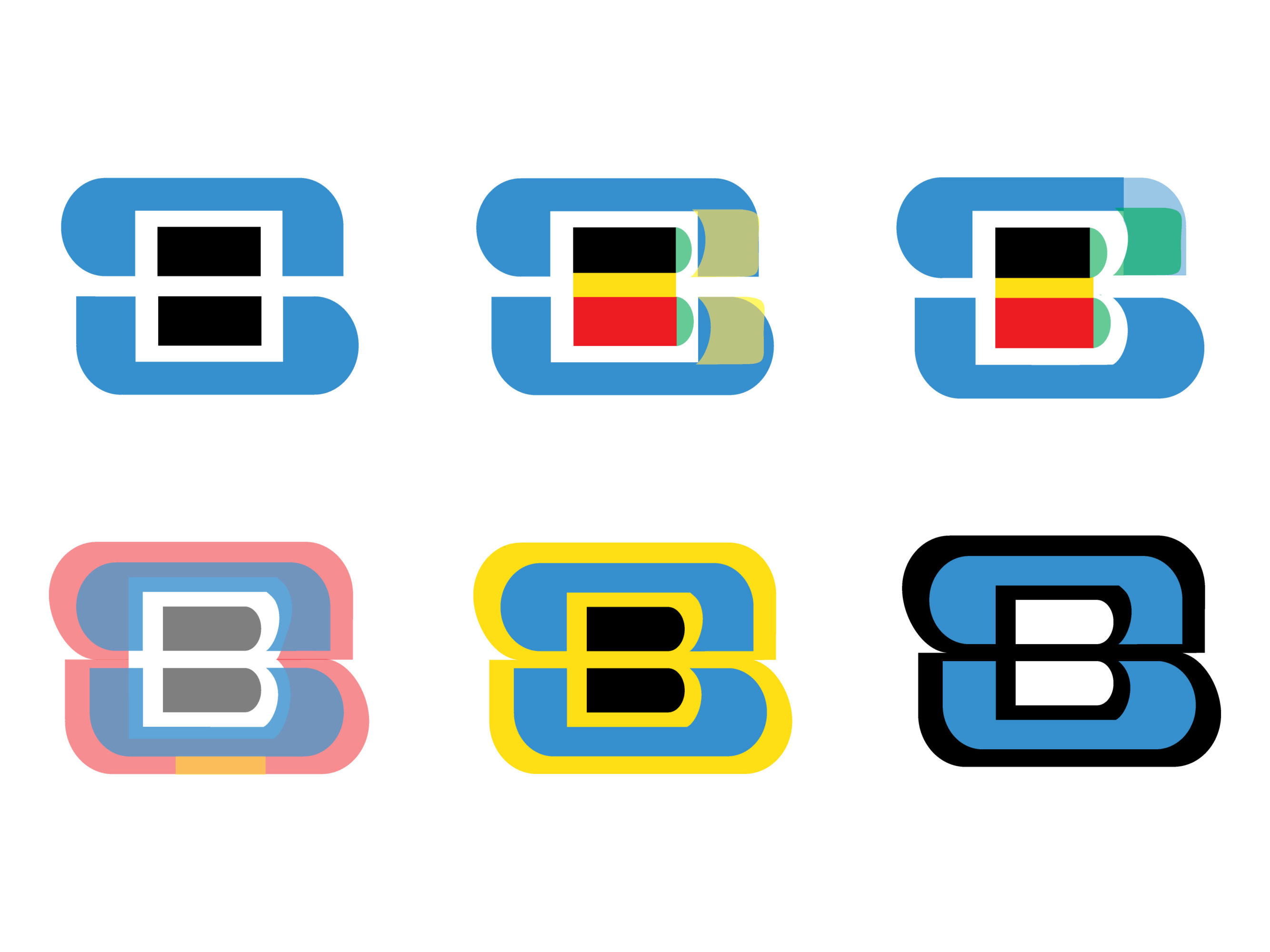
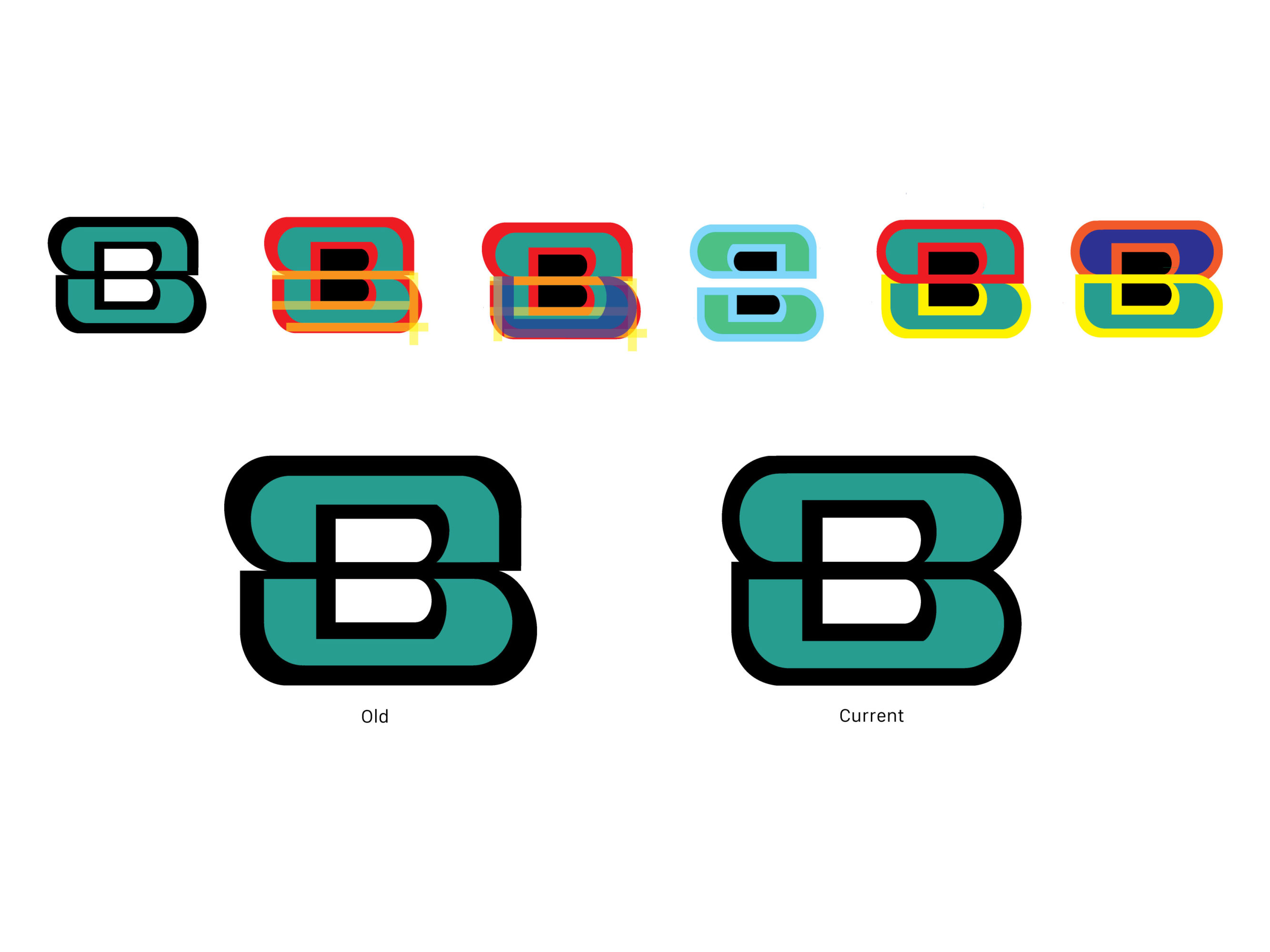
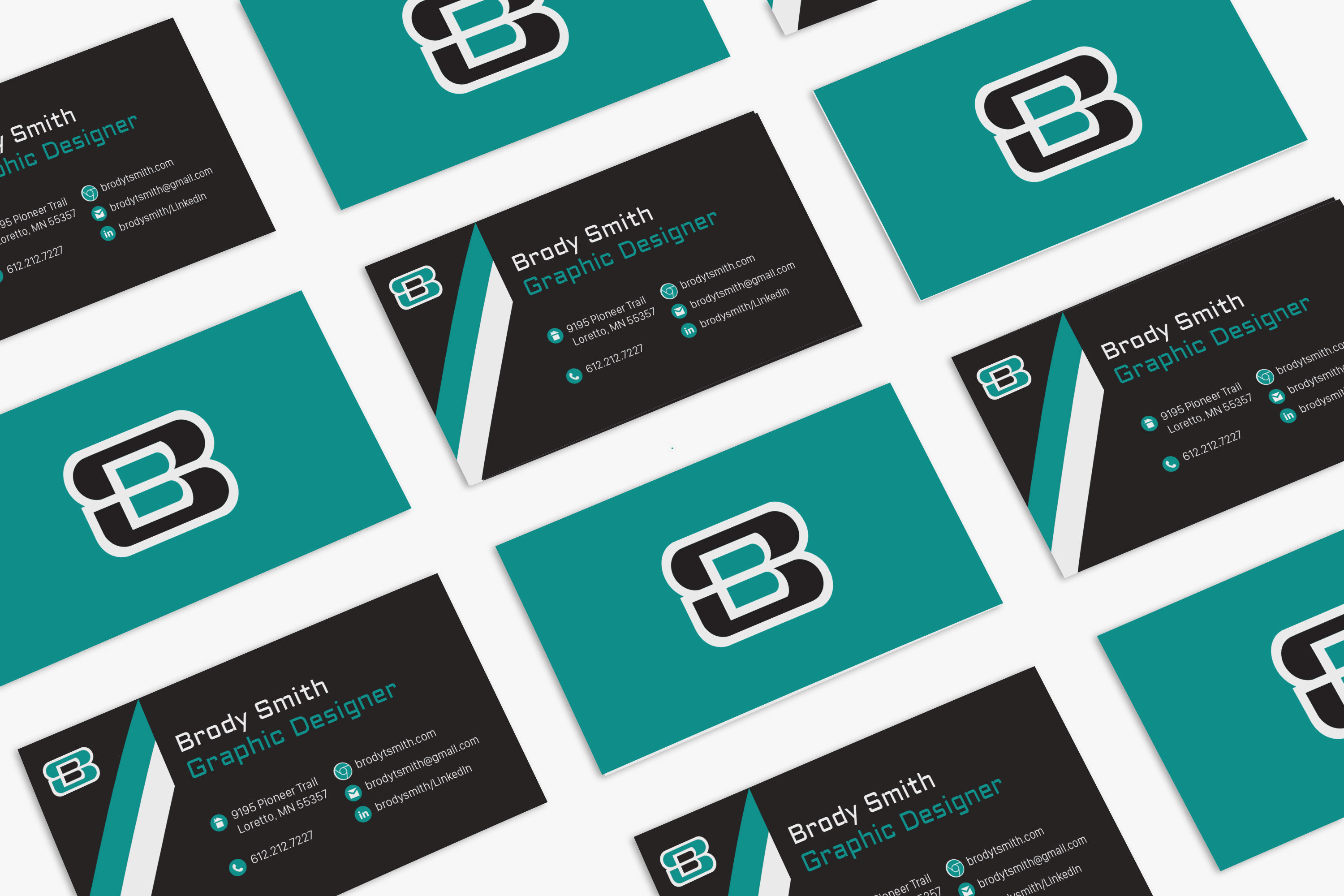
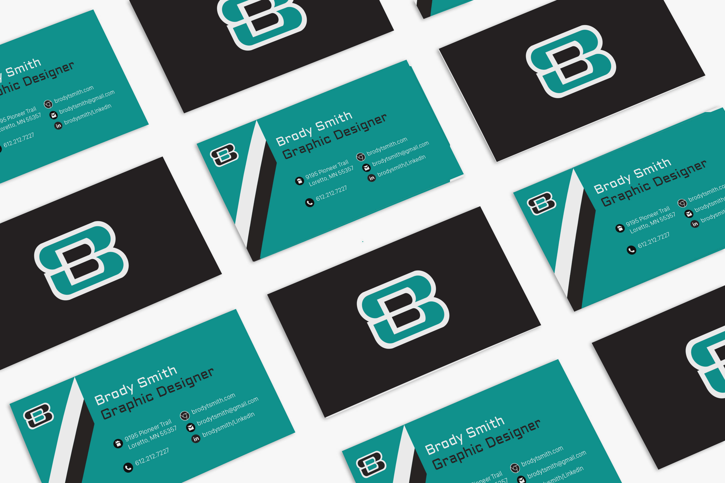
The final solution is greatly centered on the logo. The mark is bold while still being slightly ambiguous to the viewer. It is composed of a simple “B,” which shows my need to stay organized and on track. The large aggressive “S.” represents my highly competitive nature while showing that I’m not afraid break away from the norm.
I was greatly inspired by sports teams and their branding coming up with the final stationary set. I believe the iconography transfers well between print and web applications.

Comments are closed.